
Buttons (display element type)
 (only
available for certain programmable terminals)
(only
available for certain programmable terminals)
Contents
- Introduction
- Properties of a graphic button
- Special (rarely used) features of programmable buttons
- Syntax for a button in a backslash sequence
- Interpreter commands to control buttons on a display page
- Interaction between buttons and the script language
- Examples
See also:
Introduction
Graphic buttons are only supported by certain UPT variants with 16- or 32-bit CPU. More advanced features like interaction with the script language are available in devices with 32-bit CPU, like MKT-View III / IV.
On older devices with monochrome displays, graphic buttons may look like this:
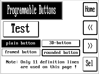
("Button Demo" with different styles, and an example for a "Check Button")
A 'hotkey' can be defined for every graphic button, usually one of the function
keys close to the graphic button. When the user presses the key, the button
will immediately be inverted on the screen, and the programmable button event
is executed. If there is a touchscreen on the display, the same reaction is executed
when the user touches the area over the graphic button. With a touchscreen (as available in MKT-View II/III/IV),
'hotkeys', i.e. physical keys on the membrane keyboard, are rarely used.
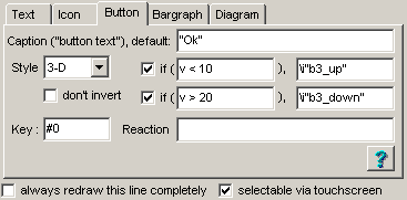
Every button has a set of properties which must be defined on a special panel on the 'display line property' tab of the programming tool:
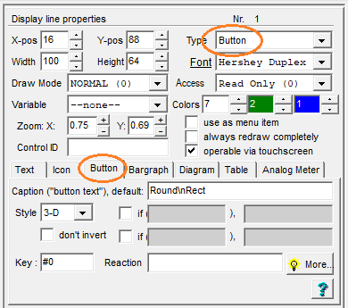
Screenshot "Eigenschaften einer Anzeigezeile" mit Unterregister "Schaltfläche".
Über die hier hier einstellbaren Parameter herausgehende Eigenschaften
können mit dem im nächsten Kapitel vorgestellten Dialog eingestellt werden.
Properties of a graphic button
-
Width, Height
dimensions of a single graphic button, measured in screen pixels -
Style: select plain, framed, 3-D, rounded frame,
or filled rounded rectangle.
-
don't invert : flag to suppress the automatic 'inversion' of a button in
the selected state.
See 'Special Features' (next chapter) for details.
-
Caption ("button text"), default:
The standard text which shall appear on the button. It will be center-aligned inside the button automatically, but it's your job to make sure the text fits inside the button. If not, you may select a smaller font in the general properties for this display line. -
if (XXX), ..
Defines an alternative button text for "special conditions". An example can be found below. -
Key
Lets you define which 'hotkey' selects this graphic button. You can enter the name into this edit field or double-click it to select the key name from a list. -
Reaction
Defines what shall happen if the button is selected (by keystroke). Tthis will often be agoto-command to another display page, but you can also enter any other interpreter command in this edit field. The syntax is the same as used for 'reactions' in an event definition. To create a reaction-def automatically, double-click the field to open a special dialog window. -
Colours (3) on the 'display line
properties' panel:
The first colour defines the foreground colour. For a button, this is the colour of the text ("caption") and the frame around the button. The colour value '-1' (minus one) is a special placeholder to use the default foreground colour (specified in the display page header).
The second colour defines the button's background colour. As above, '-1' (minus one) is a placeholder for the page's default, non-transparent, background colour. Additionally, the value '-2' can be used for buttons without a background, i.e. "completely transparent". Transparent buttons are only possible on devices with a 32-bit CPU, and firmware compiled 2011-04-04 or later.
The third colour can be used for a 'gradient fill' as explained further below.
- Hint:
-
To align a graphic button near the "real" funktion key on the terminal's
keyboard, turn on the background image in the LCD simulator for
your particular keyboard. There are a few templates for such images in the
backgrounddirectory of the programming tool.
For devices with TFT colour displays, the background of a button can be filled with a colour gradient as explained here .
Button Styles (with extensions from 07/2021)
Since 2021, the following button styles are available:- plain
- Simple button with text ('caption') and a solid rectangular background,
without frames, and without rounded corners.
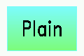
'Plain' button, but with two different background colours
to achieve the vertial 'colour gradient' effect shown here.
- framed
- Button framed with a simple (thin) line around the solid interior.
The 'frame' will be painted using the same colour as the text.
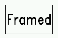
Button with style = 'framed'.
- 3-D
- Moderate '3-D'-appearance as seen in old graphic user interfaces,
realized by different thicknesses of the frame lines.
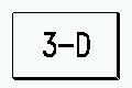
Button with style = '3-D'.
- round frame
- Button surrounded by a moderately thick, rounded frame.
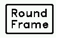
Button with style = 'round frame'.
- round rect
- Button with a solid, rounded rectangle in the background, but without frames.
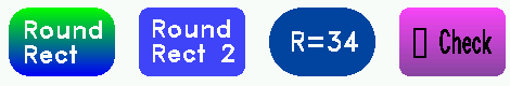
Various buttons with style = 'round rect'.
Screenshot taken from application programs/ButtonStyles.cvt.
For the style "round rect", the radius for rounded edges can be entered in the button dialog (edge radius, default = 8 pixels). This style is only available for devices with sufficiently 'large' display (at least 480 * 272 pixel) and firmware compilation date 2021-07-05 or later.
Special (rarely used) features of programmable buttons
For normal use, the properties of a graphic button explained in the previous
chapters are sufficient. This chapter is intended for advanced users
only.
Note: Most of the special features mentioned in this chapter are only supported
in devices with a 32-bit CPU (like "MKT-View II"), and a firmware compiled
2011-04-06. Older devices, like "MKT-View Plus" with 16- or even an 8-bit
CPU, do not support these functions !
Buttons signalling different states
As an example, load the display application 'programs/Button3S.cvt' from the programming tool's directory. The first page contains a few buttons, which dynamically change their Caption, depending on the value in the column 'Var/Expression' in the display definition table. For simplicity, the examples use a system timer to produce an ever-changing value. In a real-world application, this would be a variable or a CAN signal.
Let's study one of the examples, which displays a text, or two different icons, depending on the current value (v) :
- Note:
- For devices with 32-bit CPU and firmware compiled after 2011-04-06, the caption may be text or a small bitmap (icon). To insert an icon instead of normal text, use the backslash-sequence \i ("icon"), with the icon name in double quotes.
Transparent (or invisible) buttons
Graphic buttons can be used as invisible touchscreen-sensitive areas, and placed over a larger background image. To achieve this, place the background image in the first line of the display-page definiton table (so it will be painted first). Next, place a few buttons over the image, and set their background colours to '-2' (minus two means 'transparent colour'). This effectively makes the button transparent.The frame (around the button) can be disabled either by setting the button's Style to 'plain' (=no frame) and deleting the Caption (text), or by setting the button's foreground colour (first colour value) to '-2'. The latter is easier.
- Note:
-
This trick only works for devices with a TFT colour display, and firmware
compiled after 2011-04-06 .
Monochrome displays (as in the older "MKT-View Plus") don't support transparency.
An example for a large background image with invisible 'touchscreen-sensitive areas' (in fact, transparent buttons) can be found in the display application 'programs/audio_t.cvt'. Touching one of the animals in the picture plays a short wave file (which must be separately loaded into the device, but that's off topic here).
See also: transparent icons (bitmaps)
Buttons with special checkboxes via Unicode-sequence
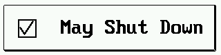
Note: The method described in this chapter has been superseded by the easier-to-use 'Checkbutton' option.The button text may contain a backslash-sequence for an 'empty box' ( ☐ ) or a 'box with a checkmark' ( ☑ ).
Here is a simple example for such a button, in the configuration dialog opened from the Simple Page Editor:
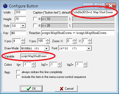
Definition of a check button using Unicode characters, for old devices (before 07/2021).
The state of variable 'script.MayShutDown' is toggled whenever this button is pressed (defined as 'Reaction').
For devices with firmware since 07/2021, use the 'Checkbutton' option instead - it's easier to use.
The 'checkmark' is controlled by a variable (here: "script.MayShutDown"), defined in the 'Variable' field.
In this simple example, the actual value of that variable must only be zero (→ empty checkbox) or one (→ checkmark set). The display interpreter copies this value into the temporary variable (aka 'placeholder' 'v' whenever the button shall be re-painted. Inside the button text, the backslash sequence
\chr(0x2610+v)
adds the value from 'v' to the character code 0x2610 (hexadecimal Unicode for an 'empty checkbox', ☐), resulting in an empty or a checked box (Unicode 0x2611, ☑). The resulting special symbol will be painted by \chr, inside the button, followed by the rest of the button text (aka 'caption').
A more advanced example (using a script to control the checkbuttons, and other special 'checkmark' characters) follows in chapter 'Examples' of this document.
Other Button Options
Devices with firmware compiled 2021-07 or later, buttons can have additional 'options' to control their appearance, use them as 'checkbuttons' without having to fiddle with Unicode characters for checkboxes (as described in the previous chapter for older devices), etc.So far, these options can only be modified in the button configuration dialog, but not directly on the display line properties panel in the main window:
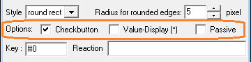
'Option' for the display of buttons in the programming tool (new dialog window, 07/2021)
- Checkbutton:
- This option adds a checkbox / checkmark on the left side of the button
(within the button area), without the need to fiddle with
Unicode symbols (as explained for older devices
in the previous chapter). The state of the checkmark (checked/unchecked)
is controlled by the associated variable, and (after interactively
switching the state) automatically written back into that variable.
- Value-Display (*):
- With this option, the text displayed inside the button ("caption") may contain
the value of the associated variable, in decimal form or as a string.
Similar as in the format string of normal text fields,
an asterisk (*) is used as placeholder for a digit or single character.
- Passive:
- Setting this option degrades a button from an interactive control element
into a simple display element. A 'passive' button can neither be
operated via touch screen (and doesn't invert its colour when 'pressed'),
nor can it be navigated to ("receive the keyboard focus") via cursor keys / rotary encoder.
This option was added along with the button-style 'rounded rectangle', because (at that time) there was no other means of creating a display element with this new shape.
Syntax for a button in a backslash sequence
(for curious and experienced users)
Internally, the button is coded as a backslash sequence. The UPT's interpreter analyses it just like any other format string in a display command (which allows you to place leading text before the bargraph sequence). If you prefer writing the source code for a display page with a text editor instead of clicking it together with the mouse, this is for you:
Syntax:
\btn(width, height, flags, caption, [hotkey, reaction_def] [,optional key=value pairs] )
where: width,height, etc are the same properties as mentioned earlier. Hotkey and reaction are optional, a button is not necessarily a control element (it can just "sit on the screen and do nothing").
The "flags" parameter is a bitcombination which describes the button's style in compact form (four bits, some reserve).
The "caption" parameter can be a fixed text string or a "C"-style conditional if-then-else expression, where the question mark is the "if"-suffix and the colon means "else". An example:
\btn(120,55,$002,((ti&15)>5)?"Button":((ti&15)>10)?"Test":"Flash")
(activate the option "always draw this line completely" for this example).
The display will show the strings "Flash" .. "Button" .. "Test" in a cycle
of 1.5 seconds, using the time-function of the interpreter. Note that this
example almost exceeds the maximum length of a display definition line.
The optional "hotkey" parameter can be used to assign
a (physical) key to the button (in addition to operating the button via touchscreen):
   F1 .. F3     Function keys, available on almost every device.
   ENTER        Enter key, or (MKT-View): Press of the rotary encoder.
   ESC          Escape key
   HELP         Help key (only present on a few old devices w/o touchscreen)
   TAB          Tabulator key (only present on a few old devices w/o touchscreen)
   A_TO_Z       'A to Z'-Taste (only present " " " " ..)
   LEFT         Cursor-to-the-left key
   RIGHT        Cursor-to-the-right key
   UP           Cursor-up key
   DOWN         Cursor-down key
New features (like the 'edge radius' for buttons with style = "rounded rectangle") will only be appended at the end of the parameter list, in the form of key=value pairs. Unlike older parameters, their 'meaning' doesn't depend on the position within the argument list, but by the key name. At the time of this writing (2021-07-05), the following key names had been implemented in the button definition's argument list:
- er= <edge radius measured in pixels>
\btn($4,"Please click\nhere to start\nthe test",0,script.StartTest(1),er=20)
Interpreter commands to control graphic buttons on a display page
Usually you don't have to write interpreter code to control the graphic buttons on a display page. If a button has a hotkey code, and the the user presses this key, button will be inverted on the screen. Shortly after this, the button's reaction method will be executed (which will be a GOTO command in most cases).
To use the graphic buttons for 'special' cases, the buttons can be controlled from the terminal's interpreter. We won't go into the details of the interpreter here, it is explained in another chapter. Here just the interpreter functions and procedures to control the graphic buttons:
- bs (button state)
-
Reads or sets the current button state. This is a numerical value between
0 and 255. Zero means, no button is selected (=inverted on the screen). Otherwise
bs holds the hotkey code of the button which is currently selected.
If you assign a new value to 'bs' (like "bs=13"), the button with the hotkey code 13 (=Enter) will appear selected, all other buttons are not selected. The effect is almost the same as if the user pressed the ENTER key, BUT: assigning a value to 'bs' only changes the button state, but it does not execute the button's reaction method. - bk (button key)
- Can be used to execute a button's reaction method. Use a formal assignment (like "bk=13"). The effect is almost the same as if the user pressed a button's associated hotkey (like the ENTER key for a button with hotkey code 13). Shortly before the button's reaction method is executed, the button will be inverted on the screen to provide some kind of user feedback.
What can this be used for ?
- "radio" buttons where only one out of N buttons is "on", all others "off".
Use the function 'bs' to check which of the buttons is currently 'on', or
assign a value to 'bs' to turn exactly ONE button on and all other buttons
off.
(Note: the hotkeys of the buttons don't have to be existing keyboard codes,
if the buttons shall not be set or cleared by the user.)
Interaction of graphic buttons with the script language
A button's 'reaction' is usually a short interpreter command, but it may also
use the script language (for more advanced actions, not just "go to a certain display page").
To control the script from a button, set a flag (global variable) in the
button's reaction, which can be
polled
in the script. Alternatively, you can implement a
control event handler
for your button in the script; for example see \script_demos\ThreeStateButton.cvt.
Last not least, you can enter the name of a procedure (written in the script language)
in the button's "Reaction" field. Because the "Reaction" field is evaluated by the display interpreter,
use the prefix "script." before the name of your procedure (so the display interpreter knows that
your intention was to call the compiled script).
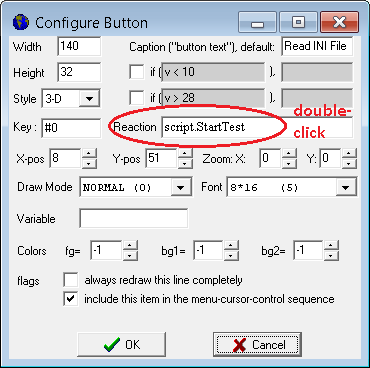
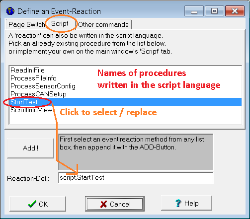
(Screenshots from the programming tool, showing how to call a script procedure
from a button )
To control a button from the script, assign a unique
name or (alternatively) control-identifier
to the button.
You can then access the button from the script through the script's
display.exec command.
See also:
Interaction between script and display (in the script language reference).
Examples using the 'Button' display element
Some easy examples using buttons have been presented in the preceding chapters of this document.A more sophisticated example, which only works on devices with ARM-Cortex-CPUs (like MKT-View III, IV), can be found after installing the programming tool in subdirectory programs/script_demos, application ButtonEventDemo.cvt.
The demo uses script-controlled buttons which (when operated via touchscreen) 'do something' when pressing the button, and something else when releasing the finger (or pen) from the touchscreen again.
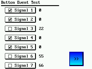
All buttons on the page shown above are controlled by a common event handler in the script.
The script also controls the checkboxes inside those buttons, turning them into "checkbuttons".
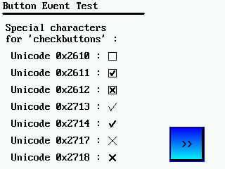
The checkboxes are painted using backslash sequence \chr(<code>)
inside the 'button text'. Here, the character code is a hexadecimal Unicode value:
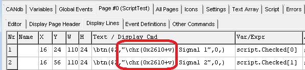
Definition of a check button using Unicode characters, for old devices (before 07/2021).
For devices with firmware since 07/2021, use the 'Checkbutton' option instead.
(0x2610 = ☐ = 'BALLOT BOX')
and a 'checkbox with checkmark'
(0x2611 = ☑ = 'BALLOT BOX WITH CHECK'),
which fortunately have subsequent 'codepoint' values. Adding zero or one (= value passed as placeholder 'v') to the code for an 'empty checkbox' turns it into a 'checked box'. Thus, with script.Checked[x]=0, the box is empty (Unicode 0x2610), and with script.Checked[x]=1, it's checked (Unicode 0x2611).
When operated (via touch), the script toggles script.Checked[] according to the button's user-defined identifier:
func OnControlEvent(
         int event,     // [in] type of the event, like evClick, etc
         int controlID, // [in] control identifier (from page-def-table)
         int param1,    // [in] 1st message parameter, depends on event
         int param2 )   // [in] 2nd message parameter, depends on event
  local int i;
  select( event )
      case evPenDown: // the TOUCH-PEN was just pressed over a display element
         select( controlID ) // on WHICH control element was the touch pen pressed down ?
            case idButton1:  // 1st button PRESSED, or...
            case idButton2:  // 2nd button PRESSED, etc....
               // Turn the button's control-ID into a zero-based array index:
               i := controlID - idButton1;
               Checked[i] := ! Checked[i]; // invert state for the checkmark
                  ...
         endselect;  // controlID (for event 'PenDown')
         ...
  endselect;
endfunc;
Last modifications:
- 2021-07-19 : Added 'Checkbuttons', rounded filled rectangles, decimal values in the caption, and 'passive' buttons.
- 2016-08-17 : Described Buttons with 'checkmarks' (checkboxes) via Unicode
- 2015-03-12 : Described the interaction between buttons and script
- 2011-04-04 : Implemented and documented "transparent" buttons
- 2007-10-18 : Added the note about touchscreens and programmable buttons